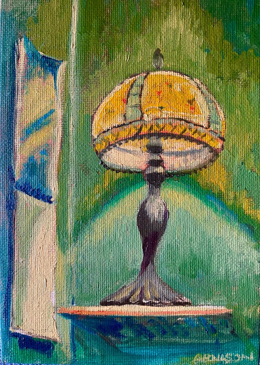
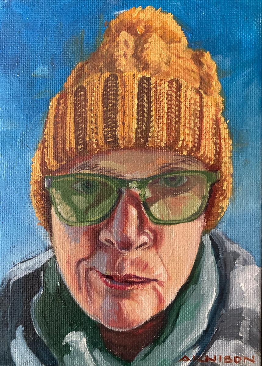
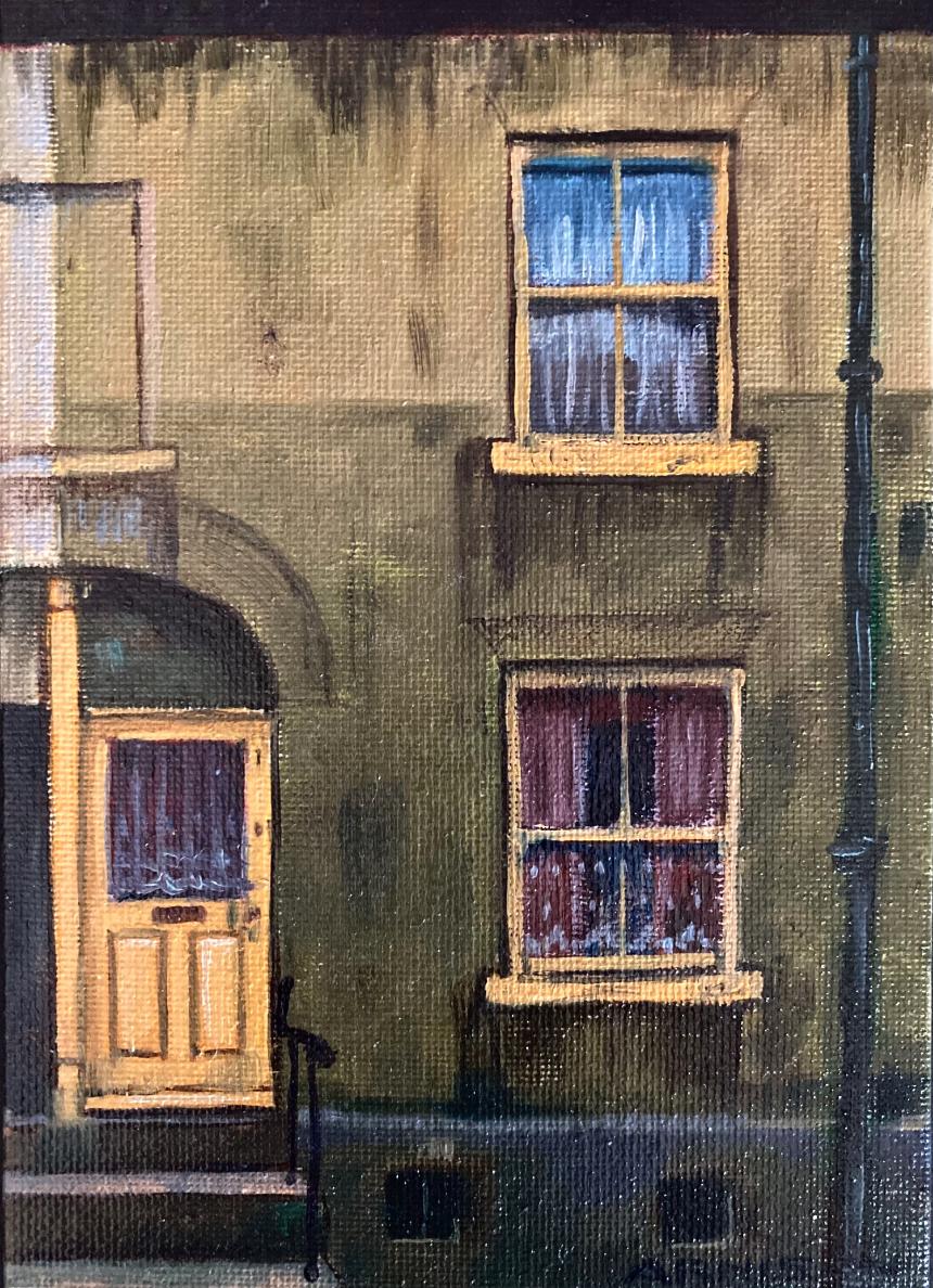
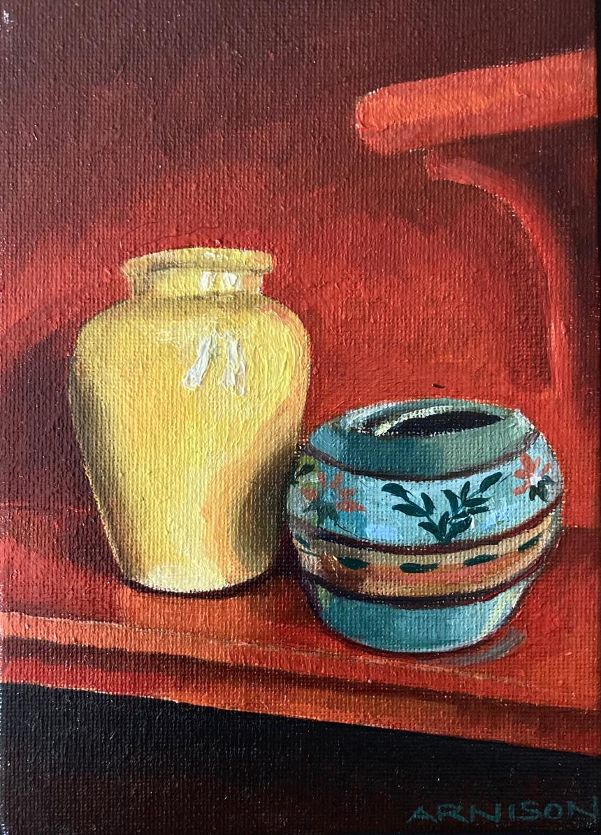
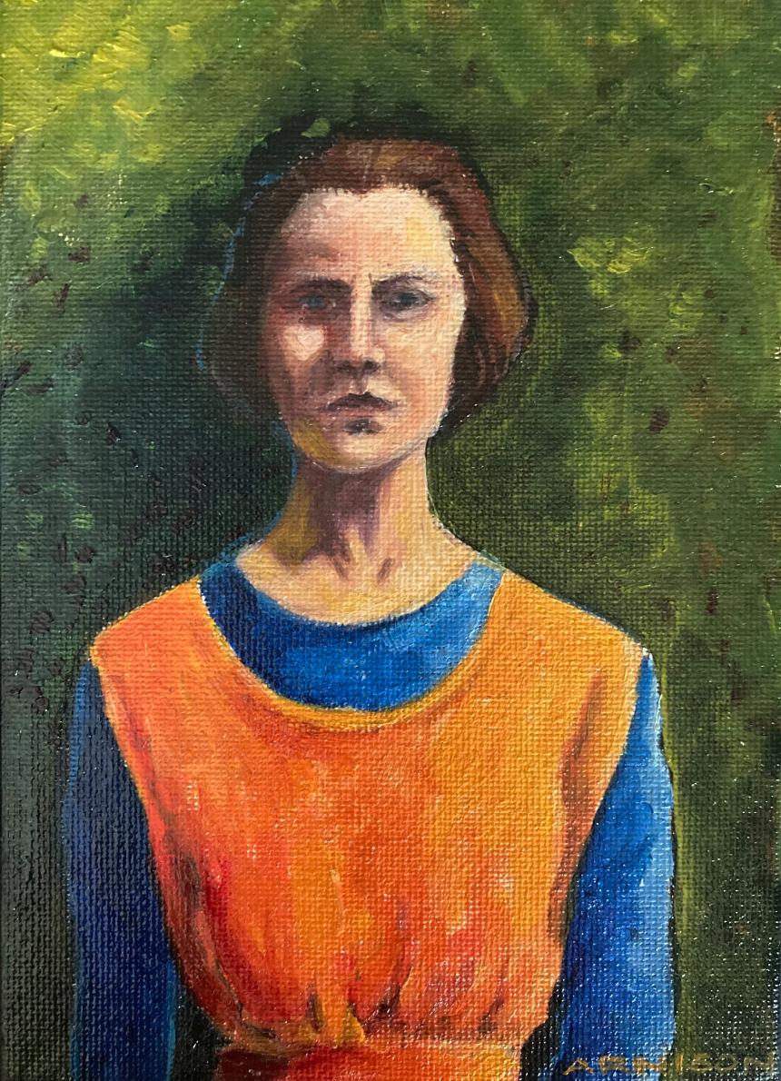
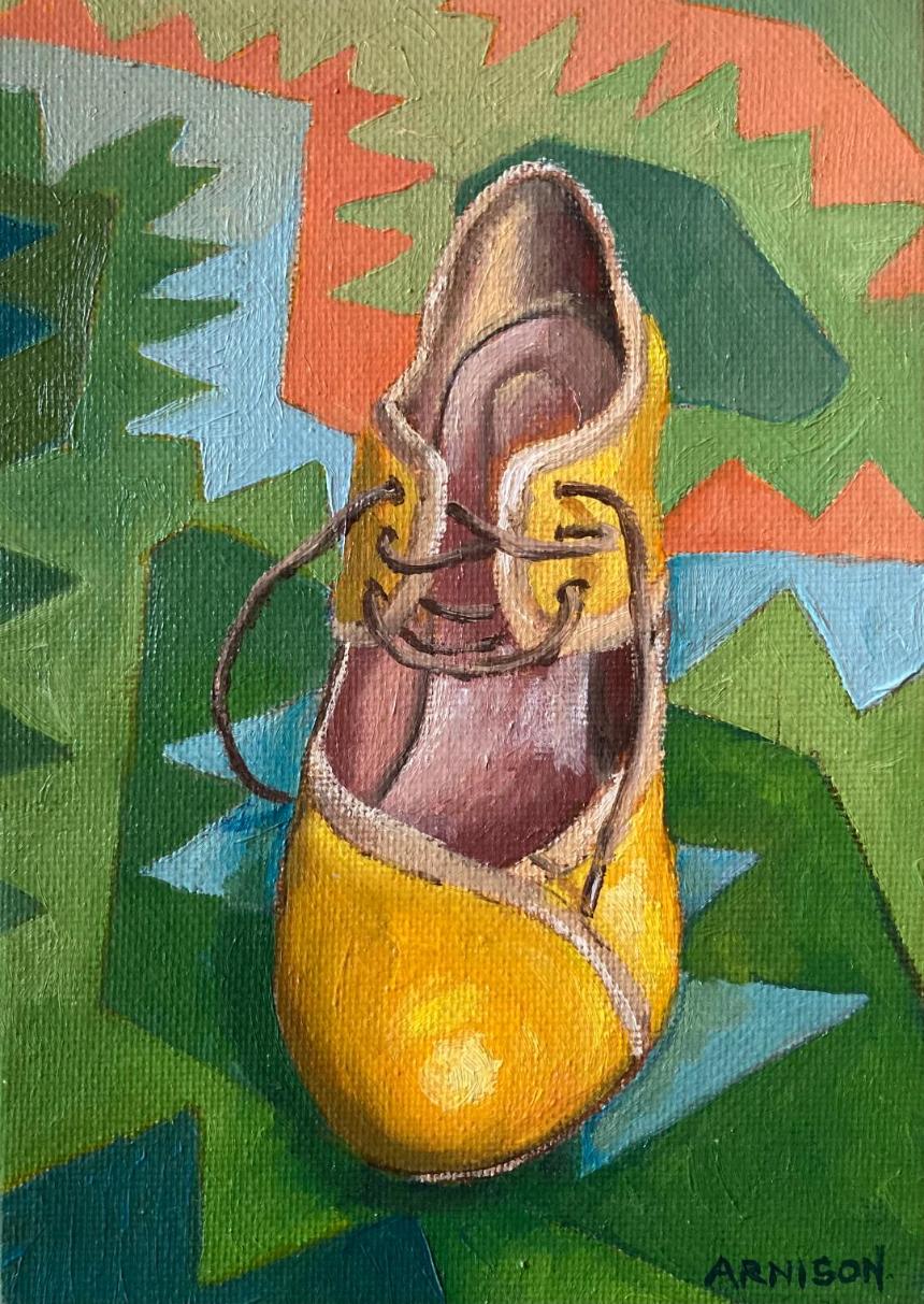
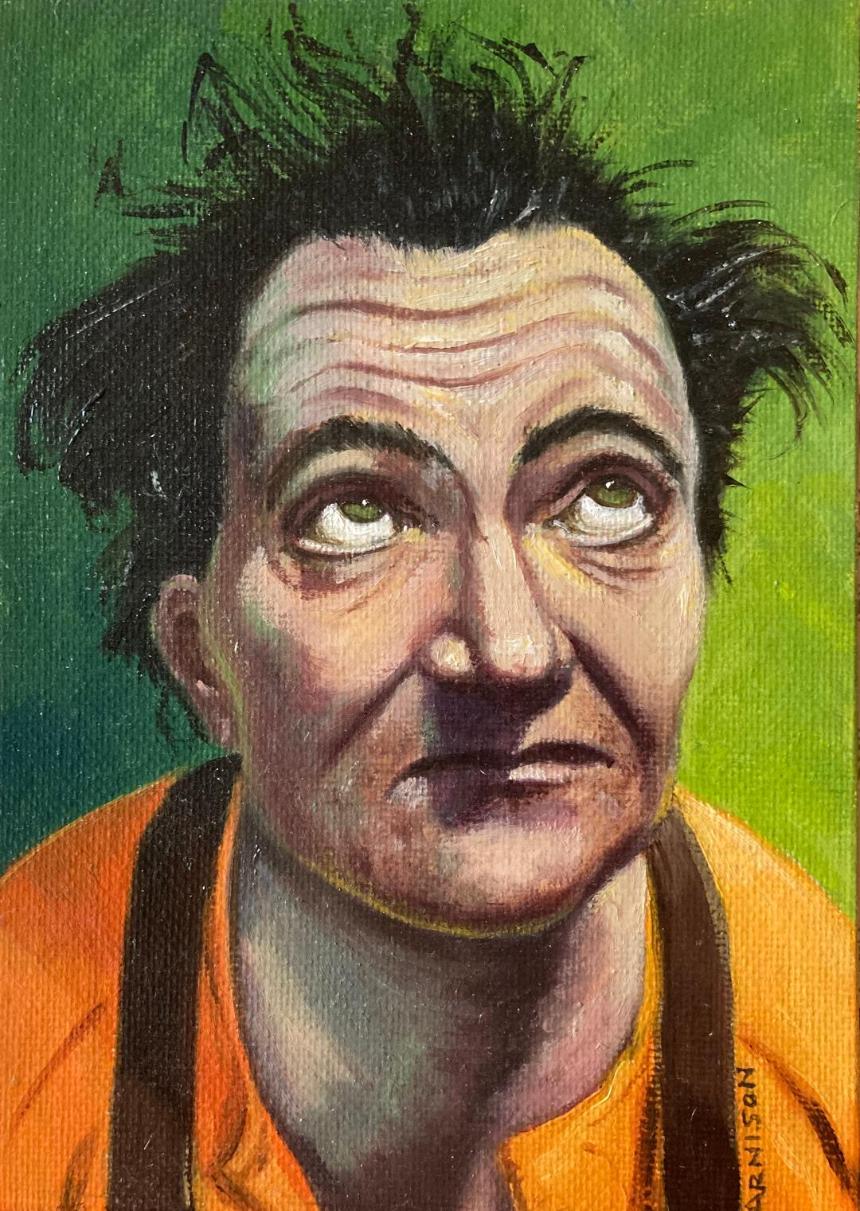
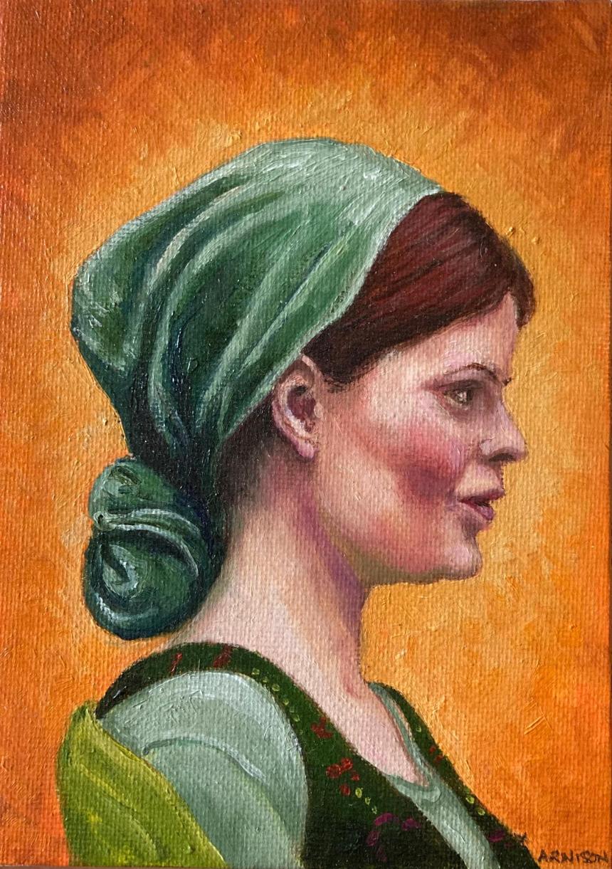
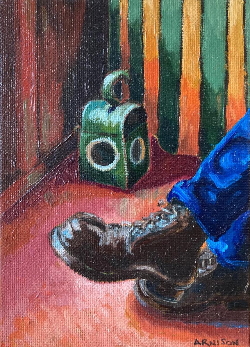
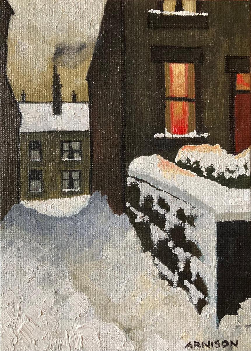
These small oil paintings explore the visual tension and harmony between cool greens and warm oranges and yellows—a colour relationship I find consistently compelling.
While the subject matter of each painting varies, the unifying element across the series is this carefully limited palette. The contrast between cool and warm tones creates both vibrancy and balance, allowing disparate subjects to sit cohesively together.
Historically, this colour pairing can be seen in the work of artists such as Paul Klee, Vincent van Gogh and Henri Rousseau, who each used complementary contrasts to evoke mood, structure and movement. Beyond painting, the combination of orange and green has also appeared prominently in interior design—from the Arts and Crafts movement through Art Deco, Mid-Century modernism, and into 1970s design—demonstrating its enduring appeal.
In this series, I draw on these precedents while exploring my own responses to colour, using palette as the primary connector between otherwise unrelated images.
These are currently being exhibited and for sale at Koda Coffee in Scarborough.